A step into the future: the Grivel brand is renewed

Published on 29/06/2019
The past is in our head and heart, the future is in our hands.
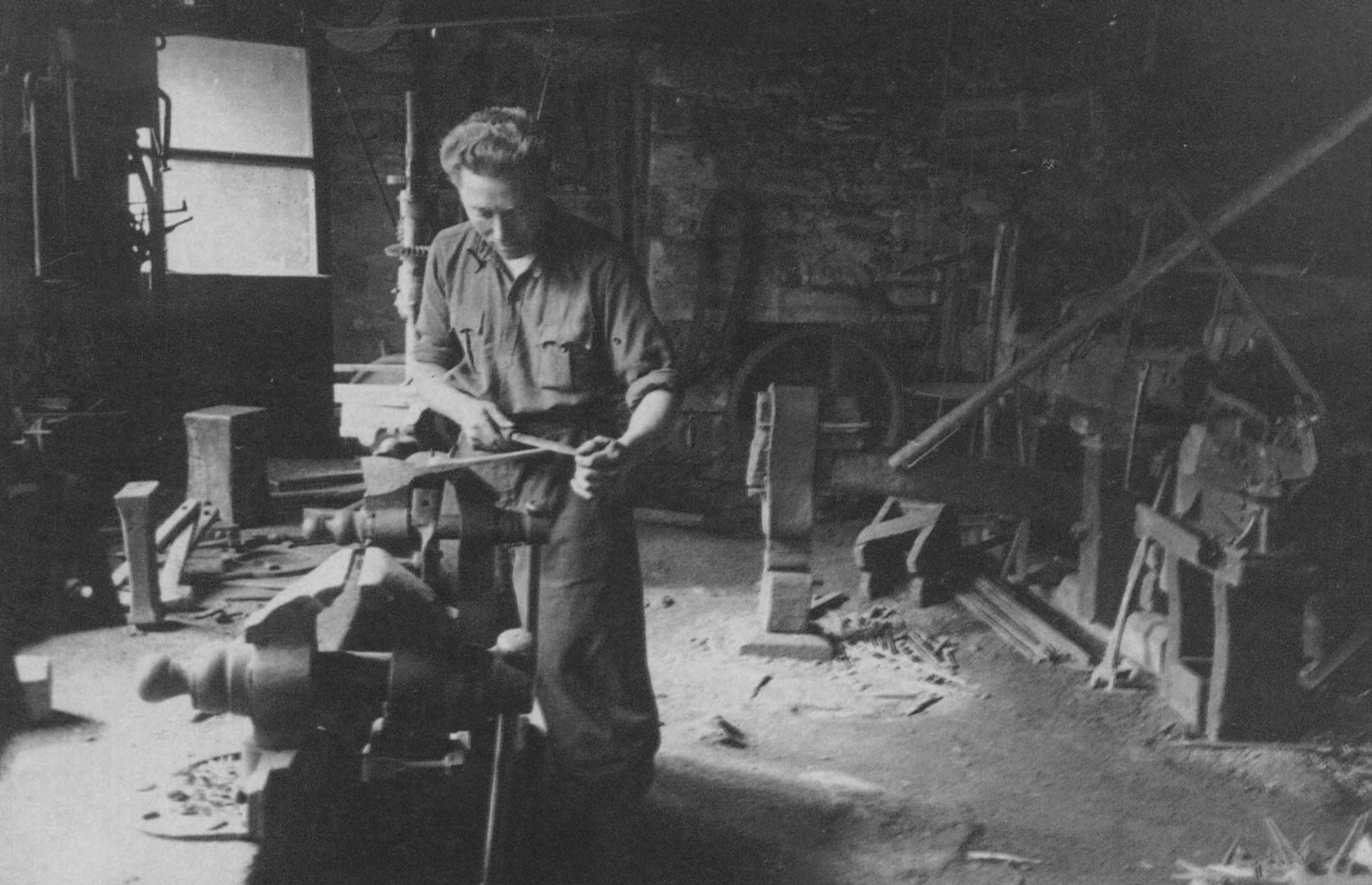
When we started working in 1818, there were no brands and logos in the modern sense of the term. There were only signs or signatures of the artisans engaged in production.
In the last 50 years, when the modern concept of brands has consolidated, we have experienced various phases and versions in communication, as often happens to those who have a lot of history and lots of creativity.
Today we find ourselves managing a continuous balance between a past rich in history and tradition, and a burst towards the future in which we are projected. Finding the alchemic synthesis between these two elements is our daily mission, in all aspects of our activity.
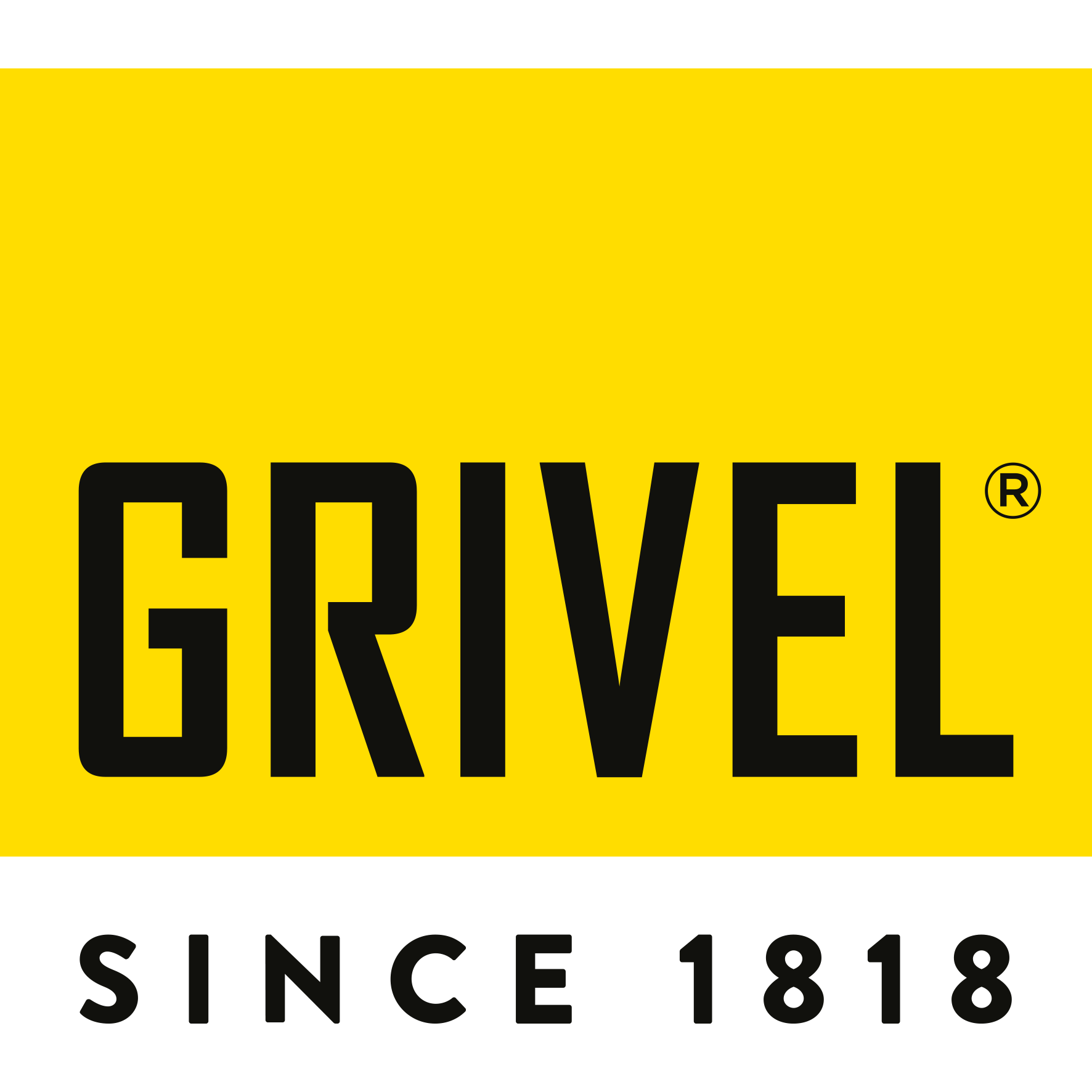
To strengthen this concept, and to consolidate the foundations of our work, we have decided to renew our identity by revisiting and modernizing our logo.
In continuity with our history and tradition, the yellow and black remain, and so does the symbol G. The G itself is however renewed in the forms and in the aspect, and the font is renewed as well.
Our hope is that in this renewed identity you can recognize Grivel and its history, but at the same time grasp a change and a desire to look ahead, to always overcome ourselves, and never stop.
We have been looking forward for over 200 years, and we still do.
June 2019


